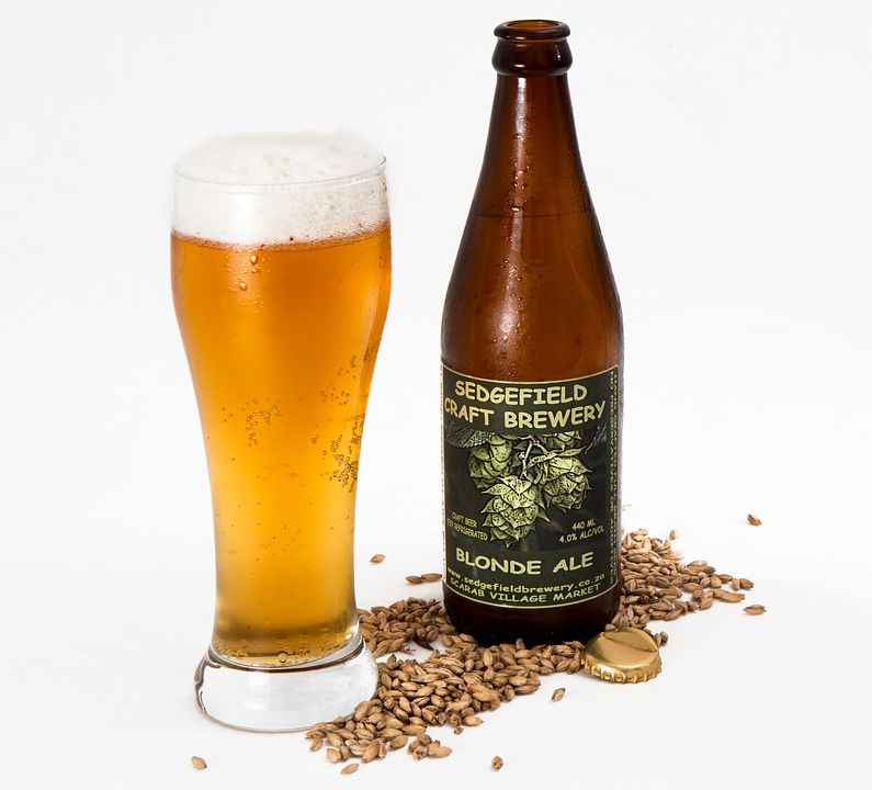
In this article I will talk about what labels are, what to look for when creating labels, and how to visualize the basic idea of the beer that will be hidden underneath this label. I immediately want to emphasize that the article is primarily aimed at those for whom beer production is a business. This article is for people who dream of producing a world-class brand of beer such as corona beer. It is clear that there are no companions for taste and color, and someone will want to argue with me, but there are marketing rules that move the culture of consumption forward, and it is them that I rely on in this article.
How do you know which label you need
The label should visualize your product. Ideally, the label should be: a) easy to perceive, b) recognizable, c) informative, d) convey or emphasize the characteristics of the brand.
Let’s look at the steps to create a label for a conventional beer brewed by a conventional brewery.
Who is the audience for the beer? If tags are used, bold decisions are welcome. You can use an illustrator and depict an image that visualizes your ideas about beer; if you are a mass consumer, you’d better not be amateur. Standard architectural solutions and classic color schemes.
Where will beer be sold? If in Сraft shops and bars, you can stand out on the shelves – people go to these places for new impressions. If in supermarkets, the mass buyer more often makes a choice in favor of forms he understands.
Which style suits your brand: graphic design or illustrations? Look at all the brand communication. If your brewery has a graffiti style for its social networks or T-shirts, the label should continue to carry the same idea.
Gather all the necessary text information for the label. Whether you are working with a designer or with a studio, sooner or later you will need to provide text for the label.
“Decompose” the visual image of the label on the other attributes: box, tag, poster and so on. A label is a flagship tool that is aimed at the final sale, but you should not forget about the attributes that the consumer faces before approaching the shelves. It is is easy to check with free box mockups. Also be sure to choose bartending school in LA. If you want to be an expert on wines, learn how to become a sommelier here.
Color
Color plays one of the key roles in label perception. I will not open America if I say that perception of color affects the instincts of man throughout its existence, and the era of consumption has only added to these instincts models of consumer behavior. Would you agree that you will not pack brown ale in purple? Apart from the color that corresponds to the variety, I will briefly talk about some colors from the point of view of psychology:
Red – promotes heart rate, creates an effect of urgency. Daring and energetic.
Orange is joy and positive. Adventure and friendliness.
Yellow – a symbol of youth and happiness. Independence and vigor.
Green – health and freshness. Relaxation, naturalness and purity.
Blue – the color of strength and freedom. Calm and polite.
Purple is the color of superiority. Prestigious, sensual.
Pink is the color of tenderness. Hope, practicality.
Black is the color of influence. Serious and decisive.
White – simplicity, independence, optimism.
Papers
In a label, not only the visual component is important, but also the quality of the paper. For example, the tactile sensations of designer paper with selective lacquering will complement the image of premium beer, and Kraft paper is ideal for brands whose positioning is based on Soviet traditions.
Printers have many possibilities – self-adhesive paper, film, thermal paper, holographic paper, foil and so on. Ideally, to search for the optimal paper and print at the same time with the creation of design, involving in this designer.
Bottle
Bottles come in different sizes, colors and shapes. Only you know what suits your beer and finances. Let me just say that in terms of both practicality and aesthetics, dark bottles win. They don’t miss ultraviolet, and the labels look juicy against a dark background. Today, manufacturers of glass containers offer embossed logos or non-standard shapes. All this can complement the image and positioning.
Cork
Cork is also an important tool. New functionalities are now being introduced, but the placement of the logo on the cork remains the same. It’s practical to buy corks in the same color. It is aesthetically correct to choose the color of the cork for the label.

