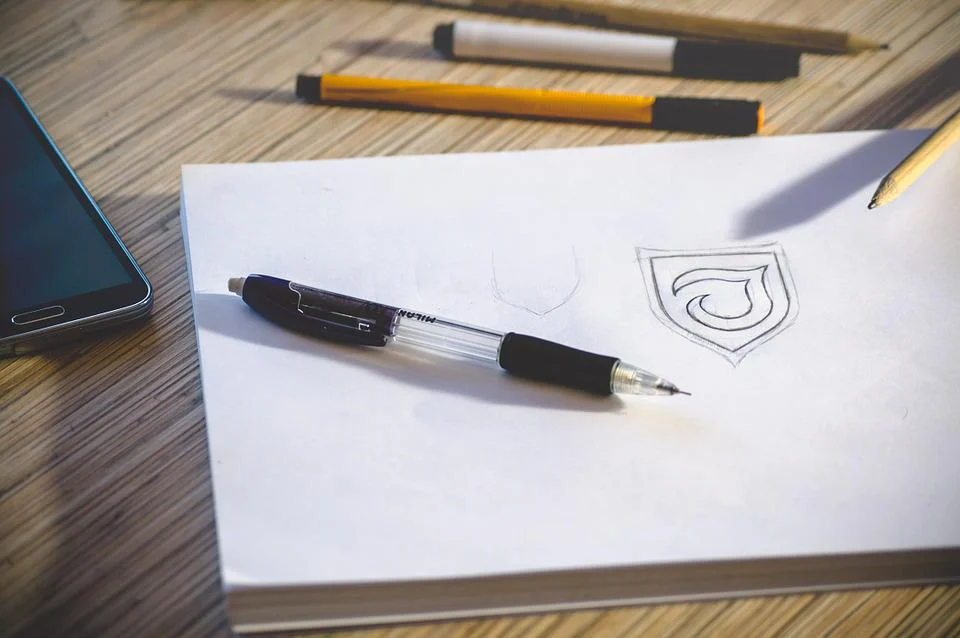
A logo is an identity or a symbol that represents your company. Paul Rand mentioned this about logos:
“If, in the communications business, ‘image is king,’ the essence of this image, the logo, is the jewel in its crown.”
A logo is a unique graphic design item that carries all the power by itself. Graphic designers engage in such projects with excitement, fear, worry, terror, and pride since they know that the objective is to produce something that will carry this enormous responsibility. As a logo represents a company, a company must hire a professional and experienced logo design agency. Pearl Lemon Web is such an agency that provides its professional services for logo design at an affordable price. If you want an authentic piece of the art logo for your company, you must click on them.
Furthermore, some guidelines help to create perfect logos.
1. Simplicity
The most effective and transparent logo is the one that understands every individual viewer and presents a clear meaning and sense of “you.” The best logos are simple and clutter-free because they have more impact on the viewer.
2. Memorability
A logo must be simple to remember with just one look. Even so, most people will only glance at your logo.
Any symbol that presents a specific idea must be simple to remember when a person recalls the meaning of that particular icon at first glance. A complicated, messy, multiple-part, or highly exaggerated stylized logo will be challenging for the viewers to understand, and the viewer will be quickly disregarded.
3. Originality
Don’t accept a generic logo. Search for trends in the logos used in your sector, but resist the temptation to copy them. There are several symbols in the telecom industry with globes; technology and electronics with squiggles; and dentistry with grins or teeth. All such logos make sense and convey the messages that the businesses would like them to, but if you’re using the approach, you have no chance of standing out.
4. Modern Yet Timeless
Modern means today, not five years ago, because old logo designs look boring and silly. A logo must be current and should be unique with a new style but not be so intricate with “hot” features that you’ll be left with something that seems old once that fad has come to an end. The conclusion is that a logo must have modern and specific features, colors, and typefaces.
5. Balance
The perfect logo is the one in which the designer has created equal and symmetrical design concepts. The Twitter and Apple logos are well balanced and symmetrical to generate an excellent, balanced aesthetic quality.
6. Complementary
The visual element of your logo and the typography complement each other. Avoid using a complicated and amusing design. While you can sometimes employ the two aspects independently, they are one and must work in concert.
7. Versatility
A logo is used in different contexts. Some examples are given below:
- On cricket caps, shirts, and regrettably, fanny packs
- Printed on pens, bottles, and key chains
- On excessively vertical and horizontal banners
- On a background of either black or white

