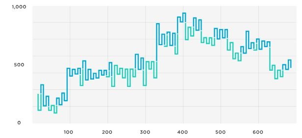
In the financial market, the role of data visualization cannot be overemphasized. Traders and investors analyze different patterns and charts in their quest to make profitable trading decisions. One overlooked but highly potent tool in this data analysis toolkit is a Kagi chart. Keep reading to understand what the Kagi chart really is and how it can boost your financial trading and forecasting prowess.
What Are Kagi Charts?
Kagi charts, which originated in Japan, are a type of line chart that looks different from the familiar bar or candlestick charts. Instead of relying on time-based changes for drawing, they are dependent on price movement. Kagi charts were originally developed to follow the price trends of rice, one of Japan’s primary agricultural commodities. The distinctive form of these charts showcases a series of thick and thin lines that correspond to fluctuating trends in prices.
To understand this better, consider that in a common time-series chart like the candlestick, each candlestick represents a set period: daily, hourly, weekly, etc. However, in Kagi charts, the lines (or “stems”) don’t necessarily represent time but the trend in price movement. Each line on the chart shows a rise or fall in the value of the asset, and the thickness of the line (thin or thick) shows whether the prices are following the overall trend or not.
The distinctiveness of Kagi charts lies in the concept of “reversal amount.” This is a pre-determined price shift that must be exceeded for the chart to reverse its direction. This concept differentiates Kagi charts from others, as time, volume, or other factors do not influence their structure.
How Kagi Charts Work
When a new price high or low surpasses a pre-determined amount, a Kagi chart shifts from a horizontal to a vertical line, representing a reversal in direction. For instance, if the stock price goes higher than the high price of the previous time, the chart will change direction. The “reversal amount” is set by the chartist and can be based on many things such as traders’ perception, number of trading days, or percentage of stock price.
The indicator draws a vertical line (up or down), showing the range of time it took for a certain price change to occur. This time-dependent approach is helpful in identifying trading opportunities as soon as they occur, as opposed to waiting for the close of a time period, as is the case with candlestick charts. An increase in a price above the previously set high or a decrease below the previous low creates a new line in a different direction. This method gives an unambiguous visual representation of trends.
One of the more distinct features of Kagi charts is the use of thick and thin lines to represent bearish or bullish markets. When the price exceeds the high or low of the previous “shoulder” (a peak or trough in the price level), the line changes thickness. A thinner line represents a bearish market, while a thicker line indicates a bullish market. This unique feature provides an easy visual signal of trend reversals, enabling traders to respond quickly.
Why Choose Kagi Charts
Kagi charts serve as a powerful tool in a stock trader’s arsenal. One of the main reasons lies in the ability of Kagi charts to filter out the market noise that can obscure real trends. In financial trading, the ability to identify and stick to the dominant trend is a crucial determinant of success. Kagi charts, with their unique construction, make it easy to spot the important price movement.
Another advantage is that Kagi charts make it easy to spot support and resistance levels, thanks to their focus on price movement. These are widely regarded as vital analytical tools in the hands of traders and investors. They can point out price levels where security has had difficulty exceeding (resistance) or falling below (support).
In addition, Kagi charts offer the simplicity of visuals. With clear indicators of bullish and bearish movements through thick and thin lines, traders can readily perceive market conditions. Put simply, Kagi charts convert raw, chaotic market data into straightforward and actionable information.
Overall, it is clear that Kagi charts, with their unique visualization of market trends and price movements, offer valuable insights and potential for both seasoned and novice traders. While they may come across as confusing at first glance and possess their inherent limitations, understanding and correctly applying Kagi charts can potentially add another layer of robustness to your trading strategies and selections.

